 Concept project
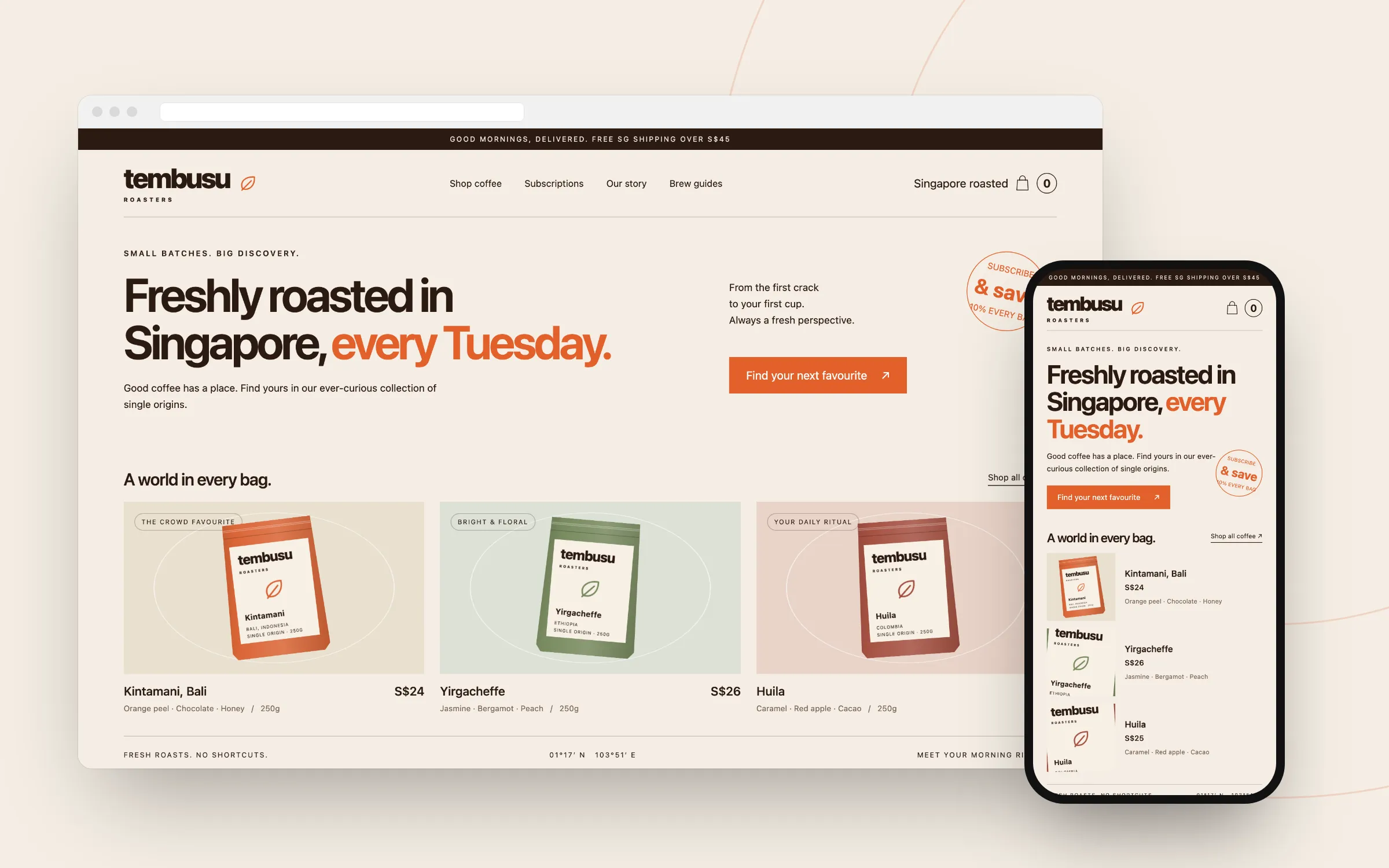
Tembusu Roasters
A Shopify store built around a weekly roast.
- Design
- Web Development
- SEO

A dashboard that shows what needs attention first.
A UI/UX redesign and design system concept for a logistics SaaS dashboard used by Singapore SMEs: UX audit, desktop and mobile screens, Figma UI kit.
This is a concept project we designed to show how we work. The brand and business are fictional, not a client of ours.
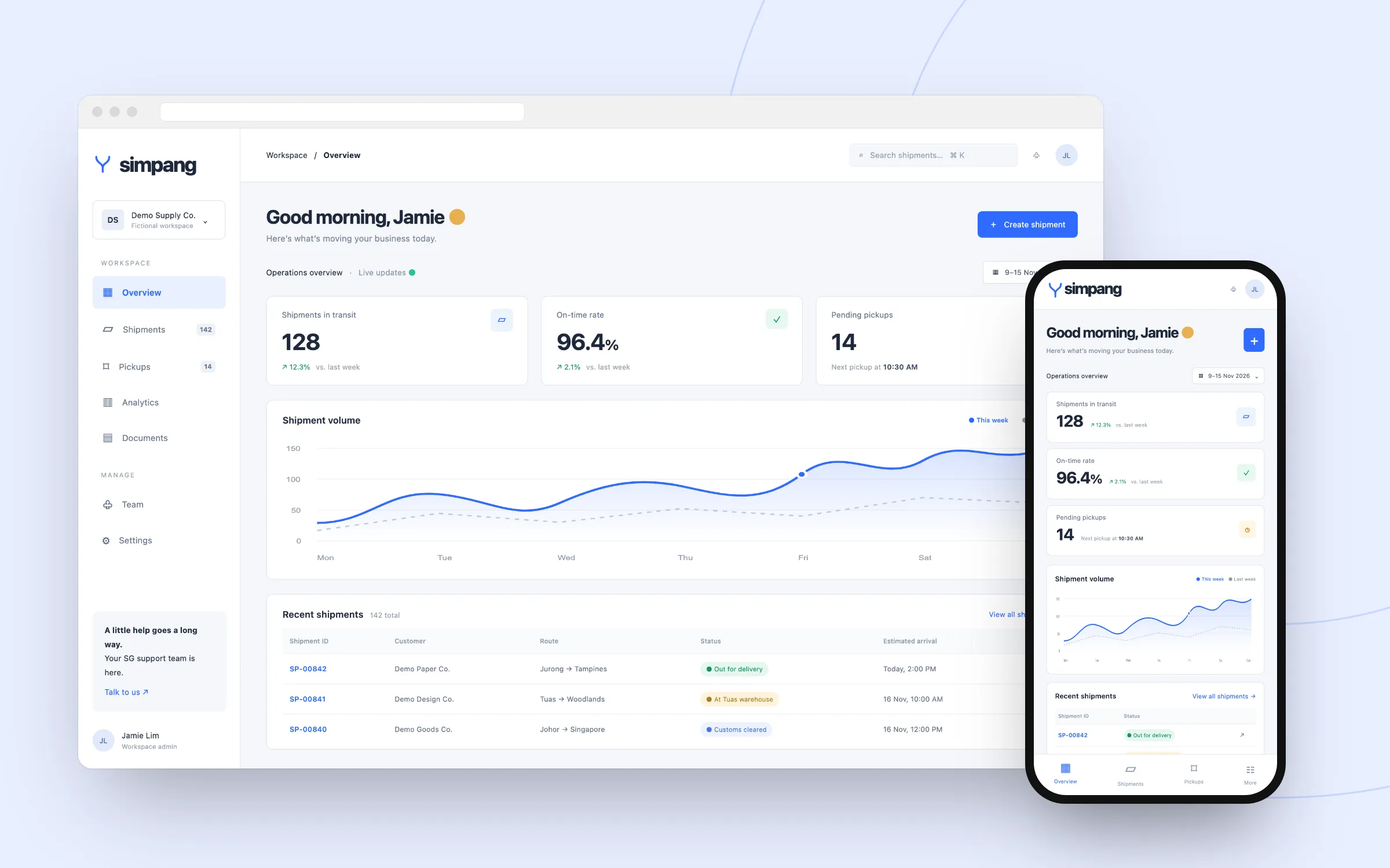
A logistics platform’s dashboard grew feature by feature until operations managers struggled to see which shipments needed attention. The challenge: reorganise the information without losing the data they rely on every day.
Mapping operations managers’ daily tasks and flagging the screens that slow them down.
A new information hierarchy: KPIs and problem shipments at the top, with details still one click away.
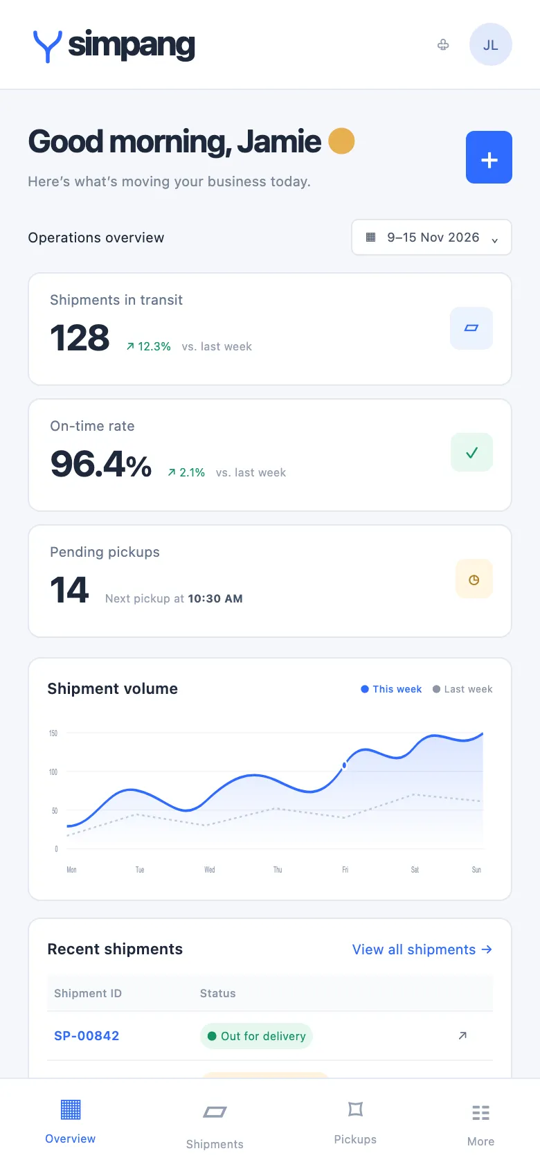
Status colour tokens that stay readable for colour-blind users, documented components, and a mobile version for warehouse teams.
Colour palette
 Concept project
A Shopify store built around a weekly roast.
 Concept project
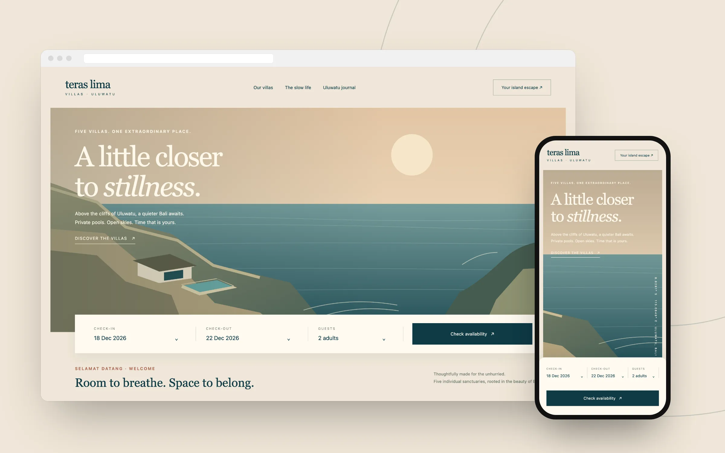
A direct-booking website that feels like the place.
 Concept project
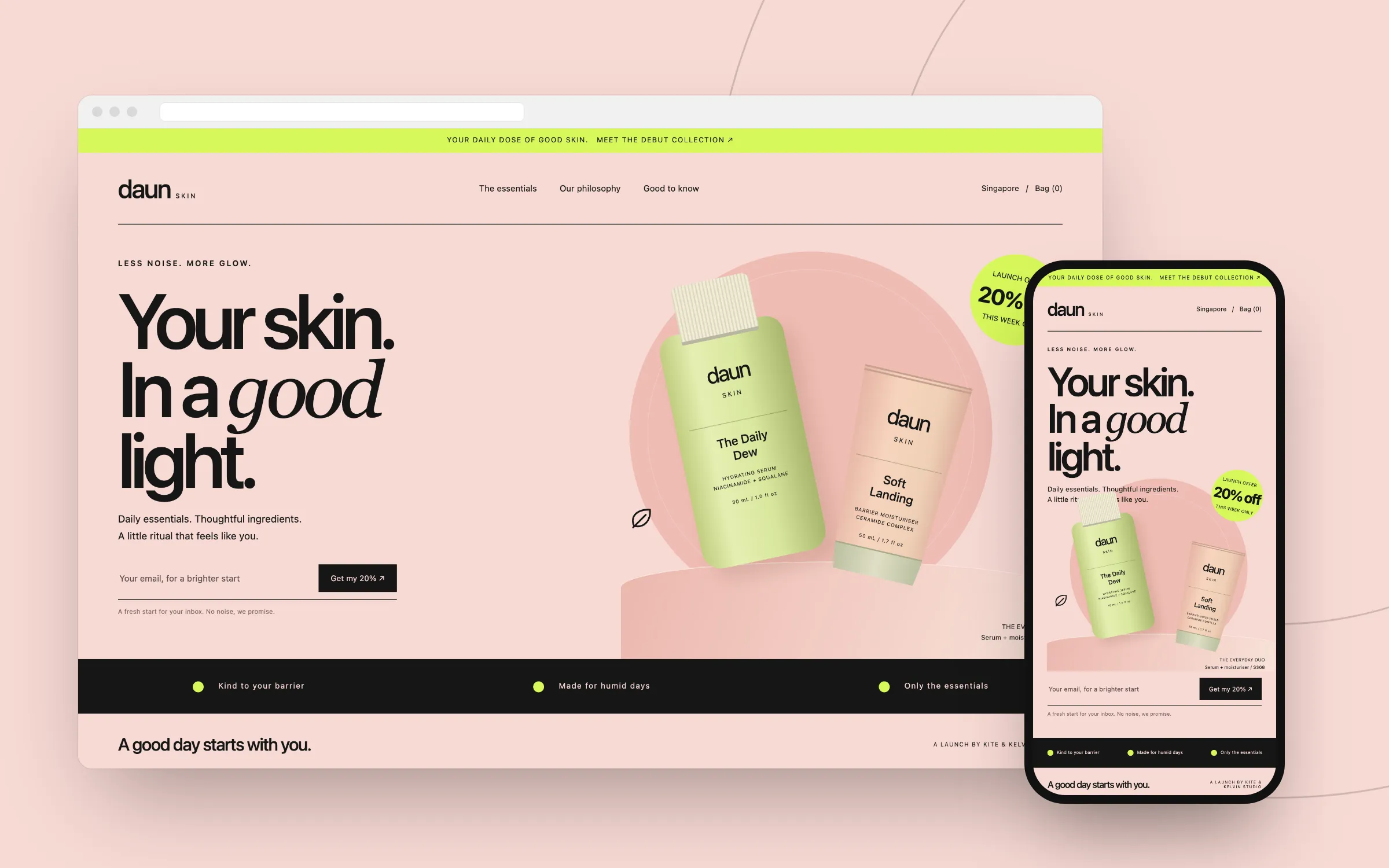
Campaign landing pages, delivered under the agency’s name.
Tell us what you need in a short call. We’ll follow up with a proposal covering scope and estimated cost, with no obligation.